
12 Fleet Branding Wrap Examples That Get Seen
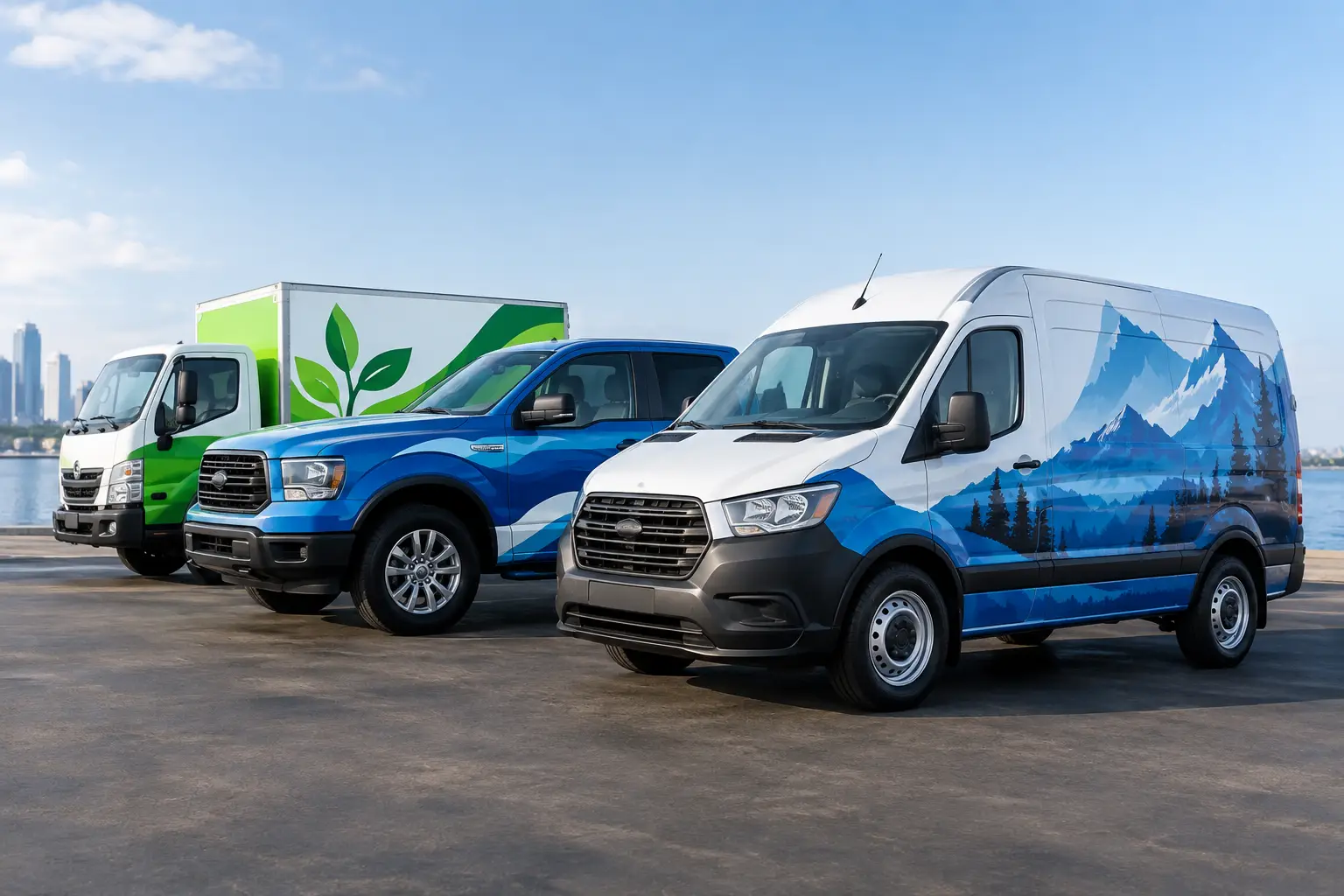
A work truck sitting at a red light in Deerfield Beach can get more attention than a billboard because people see who is behind the wheel, what the crew does, and whether the vehicle looks professional. The best fleet branding wrap examples do more than cover a van in color. They make a business recognizable in seconds, build trust before a technician reaches the front door, and keep the phone ringing long after the vehicle leaves the job site.
For service businesses, every vehicle is a moving first impression. A clean, well-designed wrap tells customers that the same care goes into the work. The wrong design can do the opposite. Tiny lettering, a crowded service list, or a weak logo wastes valuable space and can make an established company look disorganized.
What Makes a Fleet Wrap Work on the Road
A fleet wrap is not a brochure. Drivers have a few seconds to understand it while passing, parking, or watching it pull into a neighborhood. That means the design needs a clear hierarchy: company name first, what the company does second, and one simple way to connect third.
Color matters, but contrast matters more. Dark lettering on a dark vehicle may look sharp up close and disappear from 40 feet away. A high-contrast design with a strong logo, readable contact information, and purposeful color blocking performs better in real traffic. The goal is not to fill every inch of vinyl. It is to make the right details impossible to miss.
Consistency across the fleet is equally valuable. A wrapped Ford Transit, pickup, box truck, and cargo trailer do not need identical layouts, but they should clearly belong to the same company. Matching brand colors, logo placement, typography, and graphic style create repetition. Repetition is what turns a familiar vehicle into a recognizable local brand.
12 Fleet Branding Wrap Examples Worth Borrowing From
1. The Clean Service Van
A white cargo van with a bold logo on both sides, a simple two-color stripe, service category, phone number, and website remains one of the strongest formats for plumbers, electricians, HVAC crews, and installers. White creates a clean baseline, while a saturated accent color gives the vehicle presence without overwhelming it.
This approach is practical for growing fleets because it is easy to reproduce when a new vehicle is added. It also handles partial repairs better than a highly detailed printed wrap if one panel is damaged on the job.
2. The High-Contrast Blackout Truck
A black truck paired with white, metallic silver, or bright color graphics delivers a premium, modern look. It works especially well for security companies, mobile detailing operations, custom builders, and automotive brands that want a stronger edge.
The trade-off is heat and maintenance. Dark vehicles show dust, water spots, and scratches more readily in South Florida. A quality wrap protects the underlying paint to a degree, but the finished look still depends on routine washing and professional care.
3. The Bold Color-Block Fleet
Instead of printing a photo across the entire vehicle, use large fields of two or three brand colors. For example, a navy lower body, white upper area, and vivid orange logo can make a service fleet look polished and unmistakable.
Color blocking gives the wrap motion and structure. It is also ideal for businesses that need a design to work across vans, pickups, trailers, and larger commercial vehicles without losing its identity.
4. The Before-and-After Visual
Restoration companies, cleaners, painters, and pressure washing crews can use a controlled before-and-after treatment. One side of the design shows the problem, such as stained concrete or faded siding, while the other shows the finished result.
Keep the imagery focused. One dramatic transformation is more persuasive than six small photos that cannot be understood from the street. This style works because it answers the customer’s biggest question immediately: what kind of result can this crew deliver?
5. The Product-Forward Food Fleet
Food trucks, catering vans, and delivery vehicles need appetite appeal. Large, high-quality product photography can work here because the vehicle often spends time parked where people can look closely. A bright hero image of a signature dish, paired with a short name and clear ordering details, can make the truck feel like part of the experience.
Avoid placing food photos over door seams, handles, or deep body contours when possible. A skilled installer can align graphics carefully, but the vehicle’s structure should always guide the composition.
6. The Trust-Badge Service Vehicle
For home services, credibility is often the conversion point. This design leads with the brand and includes a few hard-earned trust signals, such as licensed and insured messaging, years in business, emergency availability, or a specialty certification.
Use restraint. One or two trust badges are helpful; a full collection can make the vehicle look cluttered. The customer should understand the company before reading any supporting proof points.
7. The Minimal Luxury Fleet
Premium home services, real estate teams, executive transportation companies, and marine businesses can benefit from a quieter wrap. Think satin black, deep blue, charcoal, or white with understated logos, refined lines, and selective metallic accents.
Minimal does not mean invisible. The lettering still needs enough contrast and scale to read. The difference is that this vehicle projects confidence without shouting, which can fit brands selling high-end work and personal service.
8. The Mascot or Character Wrap
A memorable mascot can give a local service business real staying power. Pest control, family entertainment, pet services, and kid-focused businesses often benefit from a bold character that is recognizable from a distance.
The character should support the brand, not compete with it. Put the company name near it, keep the services clear, and use the same illustration style across every vehicle. A mascot that changes from truck to truck weakens recognition.
9. The Neighborhood Specialist
A fleet wrap can build local relevance without trying to list every city served. Use a confident message such as “South Florida’s Pool Experts” or “Commercial Electrical Service” alongside the core visual system. This tells customers exactly where the company belongs in their minds.
For companies serving multiple regions, a consistent master design can be adapted with local phone numbers or regional messaging. That keeps the brand unified while making each market feel supported.
10. The QR-Ready Event Vehicle
QR codes make sense when the vehicle is frequently parked at events, job sites, storefronts, or community gatherings. They are less effective as the only call to action on a van that will mostly be seen at 45 mph.
Pair the code with a readable phone number and short website. The code should be large, placed on a flat and easy-to-reach panel, and tested from several distances before production. If a customer cannot scan it while standing nearby, it is decoration, not a marketing tool.
11. The Trailer-as-a-Billboard Setup
A wrapped trailer provides a wide, flat canvas that can carry a bigger message than the tow vehicle. Contractors, landscapers, mobile entertainment companies, and equipment businesses can use the trailer for large-scale imagery, service details, and bolder branding while keeping the truck design clean.
This pairing works best when both units share the same visual language. The truck should not look like one company and the trailer like another. When they arrive together, they should make a statement before the crew unloads a single tool.
12. The Full Custom Transformation
Some businesses need a fleet that looks unlike anything else on the road. Full printed wraps can combine custom illustration, textured effects, gradients, photography, and branded patterns for a complete transformation. This is a strong option for automotive companies, entertainment brands, experiential marketing teams, and businesses that live on social media.
The bigger the creative concept, the more important professional design and installation become. Complex graphics need to flow across body lines, panels, windows, and hardware without looking broken apart. This is where craftsmanship separates a head-turner from an expensive mistake.
Designing Fleet Branding Wraps for Real Work
A wrap has to survive more than a showroom photo. Service vehicles deal with sun, rain, fuel stations, tight parking lots, ladders, equipment, and daily loading. Design choices should respect how the fleet operates.
Start by deciding whether a full wrap, partial wrap, or spot graphics package best fits the budget and brand goal. A full wrap creates maximum impact and can completely change mismatched vehicle colors. A partial wrap can still look custom when the graphics are designed around the original paint. Spot graphics are the most economical choice for a large fleet that needs clean identification, but they require disciplined logo placement and strong contrast.
Also consider windows, doors, and access panels. Perforated window film can extend the design while preserving outward visibility, but it should not carry critical contact information alone. Door handles, fuel doors, sliding doors, sensors, and body seams all affect placement. Great fleet graphics are engineered for the actual vehicle, not copied from a flat mockup.
Tint Station can help turn a rough idea, existing logo, or full rebrand into vehicle graphics built for daily use. The right approach depends on whether your goal is polished consistency, aggressive visibility, or a custom build that makes your business impossible to overlook.
Your crew already drives through the neighborhoods where your next customers live. Give those miles a job to do: request a fleet wrap consultation and build a look people remember before they ever need to search for your service.